
There’s not much more to be said here, except that the logo for WWE Great Balls of Fire, an upcoming PPV event… looks like a dick and balls. Like, how does this stuff happens so often? You almost have to wonder if it was done on purpose, just for the social media viral explosion. Especially this one.
Sometimes a graphic designer or marketing guru can get wrapped up in their own work and be blind to mistakes. But, not this time; the name of the event has the word balls in it. If you see WWE Great Balls of Fire and don’t kind of chuckle, you’re cold blooded… or mature. You be the judge.
So, either someone was 100% tone deaf or this is just another great marketing ploy by Mr. McMahon.
“Vince, how do we get the word out about the Great Balls of Fire PPV?”
“Well, is Jerry Lee Lewis available? No? Ok, just put put some genitalia in the logo. That’ll get them talking!”
Well, Vince, it worked. We’re all suckers for a good wiener joke. You’re welcome for the free advertising.
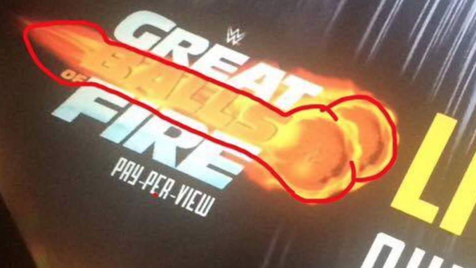
I think aside for the phallic references though, this is a big marketing fail. How many wrestling fans relate to Jerry Lee Lewis’ 1950’s rock and roll?
The only thing that WWE fans have in common with Jerry Lee Lewis is that they are both married their teenage cousins. So, perhaps Vince is an even bigger genius than I though, on levels that I can’t even grasp.
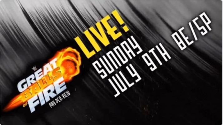
Goodness, Gracious, WWE Great Balls of Fire
@SashaBanksWWE do you think the Great Balls of Fire logo looks like a dick and balls? pic.twitter.com/RmzdVGH5UW
— Shane Wareham (@HuntRampaige) June 7, 2017
The BFF’s figuring out what the Great Balls of Fire logo looks like pic.twitter.com/MOhGWI3pkX
— taryn (@livorleave) June 7, 2017
@BruceBlitz are we going to ignore the fact that the new logo for WWEs Great Balls of Fire looks like a giant dick? pic.twitter.com/QVhydZbAVc
— Michelangelo (@mcarp89) June 5, 2017